The NYC subway system sees an average 3.6 million daily riders spread across 472 subway stations. In 2023, the average percentage of on-time service was 65% and the lowest of major city transit systems in the U.S. Many of the delays come from overcrowding during peak commuting hours and maintenance needed to keep up with the high volume of usage.
Subway users are frustrated with the inconsistent communication provided by the MTA about delays and obstructions that occur during peak commuting times.
A deeper investigation was explored for where improvements can be made to create a better commuter experience between riders and the tools used to structure their travel needs.
Problem
Duration
8 weeks: September-November 2024
My Role
UX/UI Designer
Tools
Figma
Skills
User research and testing, synthesis, ideation, prototyping, iteration, and visual design
*Educational project as part of Designlab UX Academy. Any Feedback is appreciated!
Beyond secondary research conducted online, I also looked at other tools currently available for Subway riders to use in navigating their morning commute. In a competitive analysis, I explored mobile apps like Transit, NYC MTA, and City Mapper. I also looked at indirect competitors Amtrak and Google Maps.
I noticed these apps were great at retrieving quick results for how to get to a destination but relied on written directions and hidden messaging to update and alert users.
Transit App is a gamified navigation app available in multiple countries that helps users go from point A to B. Well liked with a younger audience for its playful UI and easy to use map.
NYC MTA comes directly from the transit authority system. It includes all modes of transportation offered by the city and integrates the Long Island railroad and New Jersey lines seamlessly.
City Mapper has a strong international and tourist base for its interactive maps that encourage exploration in areas of interest. They feature options for users with disabilities or users who are concerned with environmental impact.
Amtrak was an indirect competitor since its main goal is for long distance commuting. One of the only options for train travel between U.S. cities, it offers connections to places otherwise unreachable.
Google Maps has developed it’s map system to include the NYC subway although not typically a transit app. It is known for it’s real-time train stats and broad range of updated information.
Research

Looking at the current transportation market, there were many apps that posed as NYC subway specific but it was hard to know how much mobile apps were referenced by riders. I conducted a survey with 8 participants to understand their app tendencies during their commute.


Using the survey results to broadly summarize the typical subway user experience, I was able to see how mobile apps were pivotal during transit times.
This helped shape my interview questions about a riders typical commute experience where I interviewed five Subway users between the ages of 24 and 32 to see what was most useful in their commute decision making.
Users universally felt structural frustrations with the current subway system that may not be solvable through a digital product
It is uncommon for users of the subway system to bother using multiple digital platforms when they are in a pinch and need to move quickly to their destination
Users want a more personal approach when it comes to creating and scheduling routes, saving frequently used stations, and accessing directions or updates while offline
Key Insights
From my interviews, I developed a persona to help define what users would need a digital platform to serve this communication gap felt while riding the NYC subway. The avid subway rider who values accurate data and schedule tracking to stay on top of their commuting needs, even when accidents or delays occur.
With my target user defined, I was able to examine what a solution would start to look like. I went on to organize a sketch session with four other designers that centered around
the question:
Synthesis
How might we incorporate more useful information into planning and scheduling subway commutes?


The sketch session helped me brainstorm solutions like gamification through exploring the city, creating a points system for using different routes or getting to places quickly, a map that is fun for users to use with suggestions of where to go, and improved written and visual directions for locating the best path within a subway station.
Ideation

Feature Prioritization
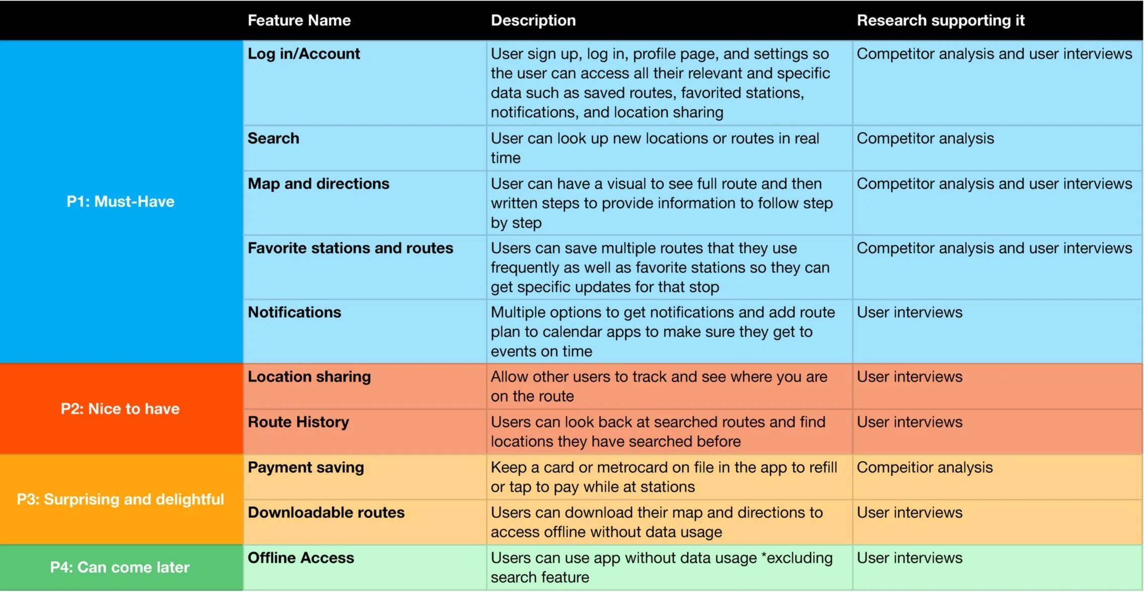
I also found it helpful to write out what features I wanted to include in my final solution. I focused on incorporating features that competitors included and then worked through what else could be implemented to diversify what my solution offered.
Listening to what was uncovered in my interviews, I made must-have features like having favorite routes and stations, notifications, and a search function.
Taking snippets of ideas from the sketch session and feature set, I dove into developing a new transportation app specifically built for New Yorkers that incorporates a playful way to develop a commuting schedule and quick access to information about stations, without compromising accurate updates or changes to their route. I curated a user flow to determine how users would interact and move through the new platform to create a route.

User Flow
To confirm the logistics of the main user flow of creating a route, I brought it into Figma to make mid-fidelity screens to conduct usability testing.
Design
I tested the mid-fidelity prototype with three participants who use the NYC subway system on two task flows.
1. Search for a route
2. Add a route to favorites
Using Google Meets, I recorded each session and followed the participant through the prototype to note where they clicked and their thought process behind their order of operations. I received feedback that the structure of the favorites page needed another pass as well as some other minor adjustments to the schedule page.
Areas of Improvement
Participants noted that some of the directional language could be improved
Adding a favorite route did not meet expectations where users thought it shouldn’t be a whole train line but rather a specific route that they use often
Some participants found frustration in syncing a schedule where they wanted an example on how to add a route first

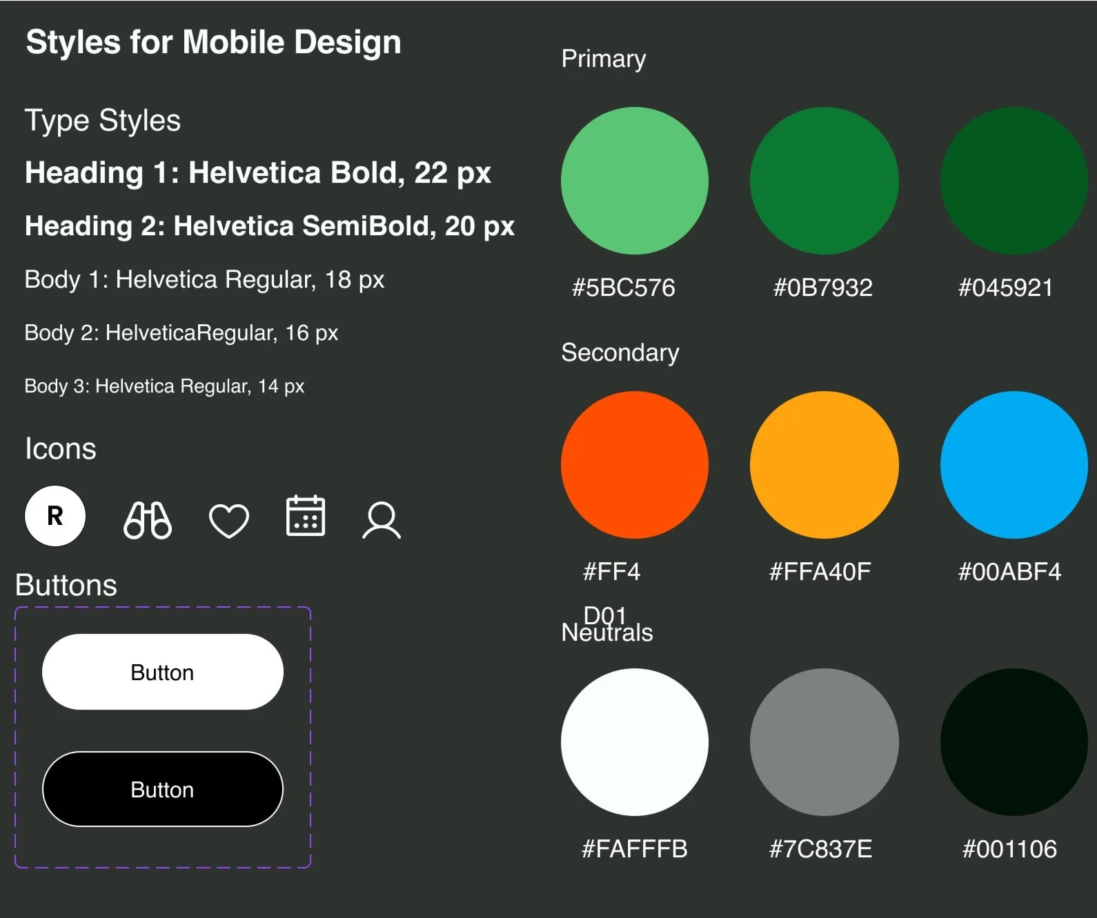
Inspired by Massimo Vignelli’s work on the iconic subway signage, I developed the Tracks branding to encompass elements that felt familiar with an edge of vibrancy.
Color associations to each line and the Helvetica type face made my initial prototype lean into a dark mode interface. After user testing, I opted to change to a bright white interface to enhance the colors of the subway lines and allow the accessibility of the map feature to really shine.
Branding
High Fidelity Testing
After my mid-fidelity testing and branding, creating high-fidelity screens to test next was necessary especially to tackle what my mid-fidelity testers had reported back to me. I tested the first iteration of high-fidelity screens with three new users but the same two task flows. I changed the amount of directional language displayed under subway route search results and implemented more screens for adding a favorite route. In this round of testing, participants appreciated the clearer action items and liked the aspect of favoriting a station rather than a whole subway line. This made it seem more personal and that they would only get updates about a station they directly use.

I also found in this second round of user testing, users were appreciative of having a success state once they completed the task of adding a commute to their schedule. This feedback made it clear that the participants finished the task and was saved in their profile. Overall, users noted some more possibilities into what could be further improved but were receptive to changes between mid-fidelity and high-fidelity.

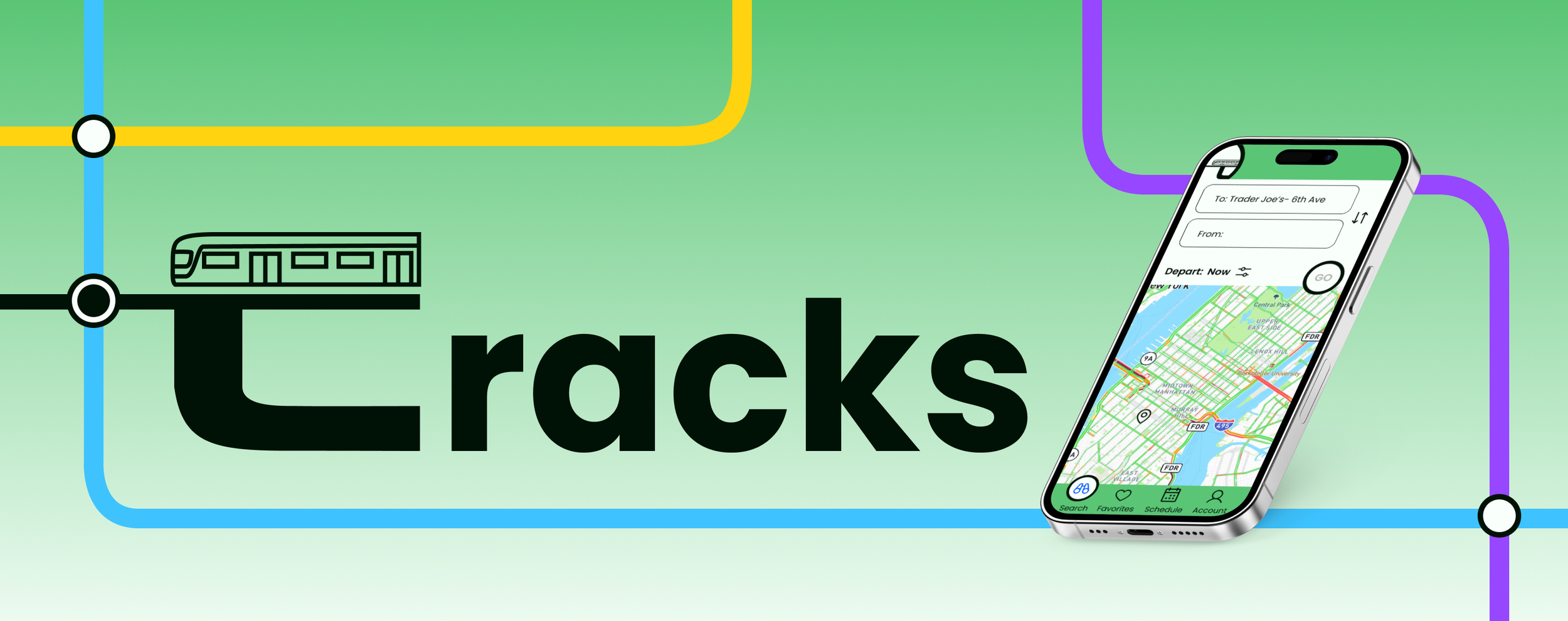
After doing one round of testing in mid-fidelity and one round of testing in high-fidelity, I moved forward with tweaking my screens to complete the final prototype. Based on my results, I was able to finalize my design choices to achieve an end-to-end app that guides user input to create a subway commute with the most relevant information they need using NYC transit. Tracks is centered around the current structure of the NYC subway system and transformed it into a new digital product that felt familiar but also fresh and focused on the most important needs for a user's commute.
Tracks is all you need for when you move through the New York City subway!
With the ability to make your own routes and commuter schedule, finding information that matters is right at your fingertips. Using Tracks offers reliable information about your favorite subway lines and alerts you when changes occur. We invite you to explore Tracks that makes commuting stress free.
Using the arrow keys, click through the final prototype.
Solution
Growth Opportunities
This project was a great learning experience that taught me how lower fidelity prototypes can have imperfections and to expect iterations. I think I spent a lot of time trying to really nail my first pass at my main user flow in my mid-fidelity, which took up a lot of time that could have been used to improve my final solution. I found so much insight from each interview round and new ways to configure a strong flow, that more rounds of testing would have been really impactful. If given more time, I would love to push my schedule flow further with the addition of alerts and a few more passes at configuring the favorites page to showcase more pertinent information that users may find helpful to have quick access to.
Working within the constraints of the NYC subway infrastructure was very informative to how a digital product can help users overcome physical obstacles. I really enjoyed learning about user hurdles in how inaccessible certain subway stations are and how the signage seemed to be a point of confusion, no matter how long you have been using the subway system. The importance of having an app that incorporated familiarity within the current structure became my goal where I would love to see what else could be added in improving the communication and accessibility imbalances.
If you have read this far, thank you so much for looking through this case study and supporting my work!