In recent history, there has been a steep divide between the US government representation and it’s constituents, with many grassroots organizations calling on change to start small and at the local level.
Voters have a hard time finding information for local elections and staying up to date with how local officials serve their communities.
Looking at smaller scale elections, there is a disconnect in communication between people that live and work in those areas with when they need to prepare for elections. There is a huge drop between voter turnout from national elections to local elections. So far, there has not been great attempts made to give broad access to this important information and allow people to truly participate in voting in all capacities.
Problem
Duration
4 weeks: April-May 2025
My Role
UX/UI Designer
Tools
Figma, Google Applications
Skills
User research and testing, synthesis, ideation prototyping, and visual design
*Educational Project. Any feedback is appreciated!
I looked into platforms that specifically targeted political races with the goal of voter outreach and retention. Coincidentally, these platforms were often in the early stages of implementation or non-profit organization efforts that were created in response to filling the gap.
Out of all of the platforms explored, none of them addressed community issues or outlined representatives that work at the local level. Some of these platforms no longer update anymore, but the ones that have continued beyond an election cycle have opportunities to expand their reach.
As I looked at each of these platforms, I was curious how actual voters felt and what voters typically gravitate towards. All of these platforms still relied on the user to know the cycles of elections, the voting process, and have an interest in politics.
From analyzing competitors already available, I was able to start understanding why they didn’t achieve mainstream success with voters. To align my solution with what was missing from these platforms, I went to interview real voters on their experience with participating in local elections.
Research

I conducted five 45 minute interviews with a range of participants who had participated in elections before. Some interviewees had participated in local elections before and others had not. I included questions such as:
How do you prepare for upcoming elections?
What kind of voter information do you find most helpful?
On a scale of 1-10, how familiar are you with your current representatives (Local, State, and Federal)?
Key Insights:
Voters noted that national election coverage was far higher than at the local level for different races and issues
Voters did not feel confident in knowing who all of their elected officials were, especially at the local level, and what each work on
Voters acknowledged the shortcomings of current voting sites that felt outdated or disconnected from younger audiences
“I don't hear about some elections that are happening because they aren’t as advertised”
-Experienced voter, 30
“Something in an easier to digest medium could help spread this information to younger generations.”
-First-time voter, age 21
“Having more clarity on who reps are and what they work on would help me understand their role and participate more.”
-Experienced voter, 32
Quotes from user interviews
My interviews highlighted how voters with varying experience still had similar approaches to preparing for an upcoming election and also noted that unless you already know where to look, readily available information on the local level about important issues is scarce. This lead me to sketching with a question on my mind:
Synthesis
How might we emphasize local issues and community based representatives to increase voter participation?
While sketching, I was really focusing on trying different layouts since health insurance information is typically heavy and a lot to read through. I wanted my solution to have a fresher take on delivering this information especially for a younger audience.
Ideation
With so much detail needed in my solution, it was necessary to organize features based on priority. There was limited time in developing my final design so I wanted to push forward with features that would have the biggest payoff in the end result.
Going back to my research, I looked at including features like cost estimates for different insurance plans, creating an insurance guide to help with plan competency, and having the ability to talk with an insurance specialist directly at your fingertips.
Feature Prioritization
With those features laid out, I began to have an understanding of what kind of digital product could be used to solve for the problems outlined in my persona. I started to work on a new app that helps young professionals feel confident in comparing and selecting a health insurance plan. Within a user flow and task flow, I worked through how a user might explore insurance plans and use a fun quiz to come to a selection to sign up if they don’t have a plan in mind.
User Flow
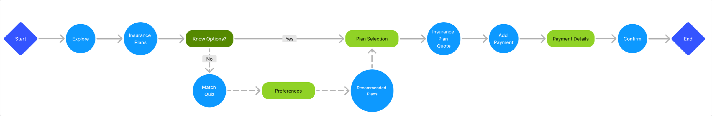

Task Flow
Translating this idea from an insurance match quiz into mid-fidelity wireframes, I made key screens in Figma to think critically about the overall user journey and test on users in my target demographic.
Design
I tested the mid-fidelity prototype with three users between the ages of 25 and 35 on three task flows:
1. Creating an account
2. Compare insurance plans
3. Using the insurance match quiz
I recorded the user interactions with the mid-fidelity prototype over Google Meets and received feedback about some structural issues. The main takeaway was to reconfigure the homepage to have an easier and quicker pathway to the main features that users would want to see.
Areas of Improvement
Expand the search bar feature so that users have an easier time finding it and using it
Participants wanted more compare plan features to better see the differences
The match quiz felt a little hidden despite being a feature users would want to use first

I tested my second iteration with three new users after implementing changes from the first round of testing including additions to the insurance match quiz and the search bar onto the homepage.
I also reconfigured the comparing plans flow (left) to be less detail heavy about the types of plans to get to the main action of selecting two plans to compare. Users this round noted that the comparing option made more sense in this way and that the insurance match quiz was really helpful now that it was front and center on the homepage.
Overall, users were pleased with completing the task flows more than the first round and were excited to see how the app would turn out in its final stage.

When I approached branding for this app, I chose a spring green as the primary brand color to evoke optimism and energy. I checked the accessibility of my color palette to have an AA rating or above. Catering to the young professional market, I incorporated illustrations from Freepik that I recolored to seamlessly add into my screens. After initial sketching, I came to the name HealthPath and liked the idea of intertwining shapes connecting to being on the right pathway for a healthy future.
Branding

High Fidelity Testing
I went onto a final round of usability testing with three new users after adding in my branding elements and a few more minor tweaks. Below is the match quiz flow that continuously got good feedback on the idea but finally landed it in a state that lived up to expectations. I also reorganized the homepage to have a more prominent search feature so that if users already had an idea about a plan or carrier, they could easily go search for it in multiple modes. The top tools sliding menu was a fun solution to showcase different features within the app and bringing in a sense of approachability using the illustrations.

This last round of testing provided reassurance in the choices I made and were solid to finalize a working prototype. HealthPath is an end-to-end app that guides young professionals to finding a health insurance plan fit for their lifestyle. Now, users have the power to shop, compare, and research different insurance plans all in one place.
HealthPath is the place where you can learn about health insurance stress-free! A unique platform that gives you the tools to know the options available to you as well as the ability to compare different plans or chat with an insurance specialist. Researching health insurance just became a whole lot easier.
Using the arrow keys, click through the final prototype.
Solution
As my first case study, this project presented a lot of challenges as I learned the ropes of UX design and taught me that in-depth research can pay off in the end. I landed on this topic of researching health insurance since it was a topic I am not typically familiar with and felt really impactful. As I tackled different obstacles, I was really grateful that I front-loaded a lot of work during the research stage where I was able to prep my interviews and usability tests well. While there was definitely no shortage of iterations, I felt really proud with each step I took in making the flows run better.
Working within the resource and time constraints of this fast-paced project taught me not to get too attached to an idea. I really enjoyed learning about a new topic alongside the people I interviewed and tested with, which validated my initial goals of the project. That made me excited to want to start solutionizing right away but my final product would have suffered and would not have held up against real-life users. My biggest lesson was seeing how important usability testing is to make sure my own preferences or beliefs don’t get in the way of the needs of the users I am building for.
If you have read this far, thank you so much for looking through this case study and supporting my work!
Growth Opportunities