In the U.S., the options of selecting the right health insurance plan depend on a lot of variables such as employment status, what state you live in, and more. With the Affordable Care Act, many young professionals rely on dependent status to retain health insurance until they turn 26 years old. Afterwards they are left conducting their own research to understand what options are available to them.
During the first search for health insurance, young professionals feel confused in understanding the best value of different plans.
Making these decisions is not easy and there is currently no way for users to check multiple plans at once. With a rising need for transparency, I looked at how young professionals research, select, and determine value in health insurance to help ease this pivotal transition in adulthood.
Problem
Duration
8 weeks: May-July 2024
My Role
UX/UI Designer
Tools
Figma, Google Applications
Skills
User research and testing, synthesis, ideation prototyping, and visual design
*Educational project part of Designlab’s UX Academy. Any feedback is appreciated!
I explored the strengths and weaknesses of four direct competitors and two indirect competitors of online insurance platforms. This was helpful in identifying gaps in the current landscape where there could be opportunities to address my problem.
The direct competitors specializing in health insurance were Healcare.gov, Healthbird.com, OPM.gov, and USA.gov. Notice that most of these sources are provided by the U.S. government to help individuals research health insurance.
The indirect competitors I looked at were Fetch Pet, a completely online pet insurance company, and Lemonade, an insurance company that is popular with my target market but does not cover health related insurance needs.
As I looked at each of these companies, I found:
Issues with concise information
Geographical limitations
No final resolution to select and sign up for a plan
All of these platforms still relied on the user to have prior insurance knowledge to trust the information that was being shared to make their decision.
Research

From my competitive analysis, I could see that a lot of useful information was out there to provide clarity in selecting health insurance. I wanted to ask more of my target market how they felt about doing this kind of research on their own and what inhibits them from making a decision about what plan to sign up for. I conducted a survey with over 15 participants aged between 25 and 35 to help narrow my scope.


Interestingly, my survey results yielded participants feeling not totally confident in their current plan with many noting that they have had to pay out-of-pocket for certain health needs.
This helped me prepare to execute five 45 minute interviews with four participants in the same target group and one participant aged 60+ to compare experiences.
Key Insights:
Employment heavily influences insurance selection
Majority of participants experienced paying out of pocket for care despite having coverage
Participants seeking help to pick the right plan used the internet and word-of-mouth
No participants claimed to have a high level of understanding their current plan
All target range participants stayed as dependents for the max amount of allotted time (26 years)
“I value things that are cost friendly and having a continuity of care where I stay with the same doctors and know my history.”
-Participant, age 32
“There needs to be a better way to find that connection between what’s offered and what people are looking for and what they actually need.”
-Participant, age 35
“I don’t want to learn about this stuff unless I have to. I don’t go out of my way to understand these things because it has been overwhelming and exhaustive.”
-Participant, age 27
Quotes from user interviews

From my research, I took the insights I gained to create a persona that aligned with the goals and challenges of young professionals navigating health insurance. The needs of the persona would help define and guide my design while using the challenges and pain points to determine the problems I was trying to solve. Young professionals aspire to understand health insurance on their own while prioritizing cost effectiveness and information accuracy.
Synthesis
I continued to think about the current existing platforms that didn’t measure up to young professionals and started sketching with one question in mind:
How might we present health insurance information that is digestible and relevant to a user's needs?
While sketching, I was really focusing on trying different layouts since health insurance information is typically heavy and a lot to read through. I wanted my solution to have a fresher take on delivering this information especially for a younger audience.
Ideation
With so much detail needed in my solution, it was necessary to organize features based on priority. There was limited time in developing my final design so I wanted to push forward with features that would have the biggest payoff in the end result.
Going back to my research, I looked at including features like cost estimates for different insurance plans, creating an insurance guide to help with plan competency, and having the ability to talk with an insurance specialist directly at your fingertips.
Feature Prioritization

With those features laid out, I began to have an understanding of what kind of digital product could be used to solve for the problems outlined in my persona. I started to work on a new app that helps young professionals feel confident in comparing and selecting a health insurance plan. Within a user flow and task flow, I worked through how a user might explore insurance plans and use a fun quiz to come to a selection to sign up if they don’t have a plan in mind.
User Flow
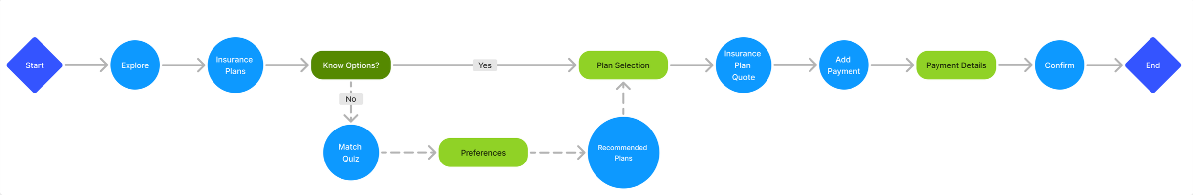

Task Flow
Translating this idea from an insurance match quiz into mid-fidelity wireframes, I made key screens in Figma to think critically about the overall user journey and test on users in my target demographic.
Design
I tested the mid-fidelity prototype with three users between the ages of 25 and 35 on three task flows:
1. Creating an account
2. Compare insurance plans
3. Using the insurance match quiz
I recorded the user interactions with the mid-fidelity prototype over Google Meets and received feedback about some structural issues. The main takeaway was to reconfigure the homepage to have an easier and quicker pathway to the main features that users would want to see.
Areas of Improvement
Expand the search bar feature so that users have an easier time finding it and using it
Participants wanted more compare plan features to better see the differences
The match quiz felt a little hidden despite being a feature users would want to use first

I tested my second iteration with three new users after implementing changes from the first round of testing including additions to the insurance match quiz and the search bar onto the homepage.
I also reconfigured the comparing plans flow (left) to be less detail heavy about the types of plans to get to the main action of selecting two plans to compare. Users this round noted that the comparing option made more sense in this way and that the insurance match quiz was really helpful now that it was front and center on the homepage.
Overall, users were pleased with completing the task flows more than the first round and were excited to see how the app would turn out in its final stage.

When I approached branding for this app, I chose a spring green as the primary brand color to evoke optimism and energy. I checked the accessibility of my color palette to have an AA rating or above. Catering to the young professional market, I incorporated illustrations from Freepik that I recolored to seamlessly add into my screens. After initial sketching, I came to the name HealthPath and liked the idea of intertwining shapes connecting to being on the right pathway for a healthy future.
Branding

High Fidelity Testing
I went onto a final round of usability testing with three new users after adding in my branding elements and a few more minor tweaks. Below is the match quiz flow that continuously got good feedback on the idea but finally landed it in a state that lived up to expectations. I also reorganized the homepage to have a more prominent search feature so that if users already had an idea about a plan or carrier, they could easily go search for it in multiple modes. The top tools sliding menu was a fun solution to showcase different features within the app and bringing in a sense of approachability using the illustrations.

This last round of testing provided reassurance in the choices I made and were solid to finalize a working prototype. HealthPath is an end-to-end app that guides young professionals to finding a health insurance plan fit for their lifestyle. Now, users have the power to shop, compare, and research different insurance plans all in one place.
HealthPath is the place where you can learn about health insurance stress-free! A unique platform that gives you the tools to know the options available to you as well as the ability to compare different plans or chat with an insurance specialist. Researching health insurance just became a whole lot easier.
Using the arrow keys, click through the final prototype.
Solution
As my first case study, this project presented a lot of challenges as I learned the ropes of UX design and taught me that in-depth research can pay off in the end. I landed on this topic of researching health insurance since it was a topic I am not typically familiar with and felt really impactful. As I tackled different obstacles, I was really grateful that I front-loaded a lot of work during the research stage where I was able to prep my interviews and usability tests well. While there was definitely no shortage of iterations, I felt really proud with each step I took in making the flows run better.
Working within the resource and time constraints of this fast-paced project taught me not to get too attached to an idea. I really enjoyed learning about a new topic alongside the people I interviewed and tested with, which validated my initial goals of the project. That made me excited to want to start solutionizing right away but my final product would have suffered and would not have held up against real-life users. My biggest lesson was seeing how important usability testing is to make sure my own preferences or beliefs don’t get in the way of the needs of the users I am building for.
If you have read this far, thank you so much for looking through this case study and supporting my work!
Growth Opportunities